What is Accessibility and Why Does it Matter?
Whether you are teaching in the classroom, online, or, more likely, some blend of the two, you are likely already in the habit of uploading some of your course content online for students to access. This may take the form of uploading documents such as Word files, PDFs, or PowerPoint slides, or authoring content directly in Moodle or on a webpage. It is easier than ever to make content available online and make that content media-rich and multimodal.
The modern teacher is both a designer and a curator of content, deciding what content is included and how it is presented. Whether content is an original creation or an external resource that you have decided to include in your course, it is important to ensure that all students are able to access and engage with the material. This benefits all students, not just with those disabilities. Everyone benefits from well designed content.
Designing for accessibility refers to designing course materials in a way that is usable and understandable by all students, regardless of their abilities, cultural and linguistic backgrounds, or learning preferences. When we refer to accessibility we are referring to an inclusive practice that is learner centered by seeking to remove barriers that would prevent learners from interpreting your course materials and engaging with the learning experience. When planning how you will present your course content, start with your students in mind. Think of the “prototypical student” you would expect to encounter in one of your courses. Now think of students who don’t fit this prototype and the barriers they might encounter. How can you design your curriculum to anticipate barriers and “teach to the margins” to be as inclusive as possible?
Removing barriers to learning ensures that all students have equal access to educational opportunities and can fully participate in the learning experience, creating a more equitable and inclusive learning environment. This approach benefits all students, not just those with specific needs or disabilities, as it helps them engage and navigate with course content more effectively. Acting proactively to anticipate and address barriers by incorporating accessibility principles in the design phase can be time consuming up front but will save you time later by not needing to be as reactive to accessibility requests.
Reflect
Think of the “prototypical student” you would expect to encounter in one of your courses. What is their background? Their strengths and weaknesses? Their motivation for taking the course? The previous knowledge you expect them to have?
Now think of students who don’t fit this prototype and answer the same questions. How might their needs and goals differ? What unique barriers and needs may they face? What changes can you incorporate into your course to make it more user-centered so you can “teach to the margins”?
A Quick Note on Universal Design for Learning (UDL)
Universal Design for Learning (UDL) serves as a useful framework for this approach to accessibility, particularly the principle of multiple means of representation. UDL is an educational framework that guides the design and delivery of inclusive and accessible learning experiences that meet the needs of all learners. The principles of UDL focus on providing multiple means of representation, expression, and engagement to accommodate the needs of diverse learners of varying abilities.
UDL rejects a one-size-fits-all approach to teaching and learning, and instead emphasizes an approach to granting flexibility, choice, and access to all students (Pilgrim & Ward, 2017). It aims to meet the needs of diverse learners by designing the curriculum to adapt to the learner rather than forcing the learner to adapt to the curriculum. By designing accessible course materials with UDL principles in mind, educators can create learning experiences that are accessible, engaging, and effective for all students, regardless of their individual needs.
A deep dive into UDL is not within the scope of this guide. You are encouraged to refer to the CAST UDL Guidelines for a more in-depth examination of the UDL framework.
How Do I Make My Digital Materials Accessible?
Following are some brief recommendations for making your digital teaching materials more accessible for all students, not just those with disabilities. These recommendations were adapted from the Accessibility Toolkit – 2nd Edition, an open educational resource available through BCcampus, and Accessibility… One Step Closer (CC BY 4.0) developed by Carolyn Teare and Carol Sparkes. Refer to the Toolkit for a much more in-depth examination of accessibility practices.
Course content should be well organized in logical sections using headings and sub-headings. This enables learners to identify the structure of your content more easily and how concepts are related, as well as quickly navigate through sections. Use concrete, specific language in your headings so learners know what to expect in that section. This benefits all learners, including sighted students and those with learning disabilities or diminished sight.
Headings should be hierarchical (nested) and sequential. Headings are numbered from 1 (highest level) to 6 (lowest level), but typically only the first three or four heading levels are used. Lower-level headings should operate as sub-headings of higher-level headings, and heading levels should not be skipped. Heading levels should be formatted consistently throughout your content so they are easily identifiable.
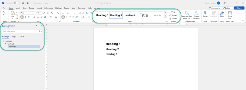
For example:
Heading 1
Text related to heading 1 goes here.
Heading 2
This heading is a sub-heading of heading 1. Text related to heading 2 goes here.
Heading 3
This heading is a sub-heading of heading 2. Text related to heading 3 goes here.
Keep in mind that screen readers will not identify different font sizes, families, or emphases as headings, even if they look like headings visually. As such, screen readers will be unable to navigate the content effectively. Ensure that headings are properly selected depending on the platform you are using.
Adding Headings in Microsoft Word
In document editors such as Microsoft Word, headings should be selected from the Styles menu rather than manually adjusting font size or emphasis. This will ensure that assistive technologies will identify the headings correctly. Enabling the Navigation pane from the View tab will display headings included in your document in sequential and hierarchical order. Including headings in Microsoft Word has the additional benefit of making it much easier to create a table of contents. The accessibility benefits are also translated to PDF format if saved in that manner.
Tip
Headings can be easily moved, deleted, indented, or promoted from the navigation pane. If your document is getting cluttered with a lot of headings, try selecting the View tab and then “Outline.” This will display an outline of your document where you can customize how many heading levels are displayed to more easily make changes to your headings or entire sections of your document.
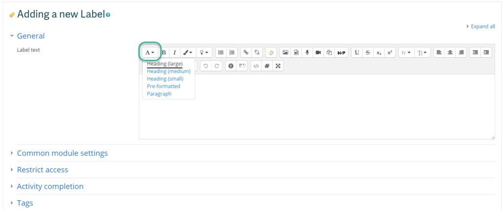
Adding Headings in Moodle
To add headings in the Moodle editor, select the paragraph styles icon. Moodle has three levels of headers, but additional levels can be manually added in the HTML editor if needed.
Font Family and Size
Choices of font and font size can be important considerations for learners who have reduced vision or those who have perceptual challenges. Clear, well-spaced text makes it much easier to interpret a document. Platforms like Moodle and WordPress have default paragraph sizes, but consideration should be given to font selection and font size when designing documents to be uploaded online. Recommended font size is between 10-14 to display well on a monitor. The Web Content Accessibility Guidelines (WCAG 2.0) recommends ensuring text can be zoomed to 200%.
A general design principal for typography is for headings to be one type of font (e.g. Sans Serif) and the body text to be the opposite (e.g. Serif). Selecting serif fonts is no longer considered problematic for display purposes, provided learners are using a relatively recent operating system and browser. Be consistent in font choices for all headings and all body text used throughout your document. This will make your document easier to interpret and more professional looking.
Serif: Strokes extend out from the top and/or bottom of the letterforms
Sans Serif: Strokes do not extend out from the top or bottom of the letterform
(Penn State Accessibility) https://accessibility.psu.edu/fontfacehtml/
Use of Bold and Italics
The use of bold and italics should be used sparingly to draw attention to key concepts. Italics can be difficult to read online due to the resolution. Reserve using bold for emphasis, and italics for the titles of works, terms that are being used abnormally, or when called for in your academic field.
According to the Principles of Multimedia Learning, people learn better from a combination of words and images than words alone (Mayer, 2009). To ensure that your content is accessible, it is important that images in your content can be interpreted by all learners. The UDL guideline for providing options for perception recommend presenting content in a way that doesn’t depend on a single sense, such as sight, by providing alternative ways of interpreting information or ways for learners to customize how information is displayed.
Using images to convey information can negatively impact a variety of learners if accessible practices are not included. The most obvious learners who may be impacted are those who are blind, have poor contrast vision, or cannot differentiate certain colours, but learners who rely on monochrome displays, printing content, have poor internet access, or have cognitive disabilities can also be impacted.
If your course content includes images, such as graphs, diagrams, or illustrations, you should first ask whether the images are decorative or serve a functional purpose. Decorative images are, you guessed it, for decorative or design purposes only. These may include banner images or groan-inducing memes. Decorative images are not necessarily a bad thing – they can be aesthetically pleasing or humorous – but they should be limited. Functional images are those that convey non-text information to students.
Once you determine whether the image is decorative or functional, decide how you will meet the accessibility needs of your students.
If your image is decorative, it may not necessarily need descriptive text. The alt text can read something like “decorative image” or be a brief description. You do not want to overload the learner with unnecessary information, but you also don’t want to leave the alt text blank, as a screen reader may read out the image URL instead.
If your image is functional, there are two primary accessibility considerations: the use of colour and the inclusion of descriptive text as an alternative way to convey information.
Images should not rely solely on colour to convey information, as information may be lost for learners who are not able to view the image or perceive the differences in colour. The easiest question to ask yourself when determining whether the colour in your image is accessible is, “Would learners still be able to perceive the information if the image was in black and white?” Strategies like using high contrast colours and adding additional context via text can help your colour images be more accessible. You will learn more about accessible practices surrounding the use of colour below.
Descriptive text provides a text description of an image should it not load or if it is being interpreted by a screen reader. It should describe what is being displayed and why it is important.
Following are three methods for adding descriptive text to functional images for students who may not be able to view them:
- Alternative (alt) text: Alt text is an attribute within an image that displays when the image does not load or is read by a screen reader. Alt text should be less than 125 characters.
- Description in surrounding text: If the alt text does not provide sufficient space to describe a complex image or diagram, consider putting the descriptive information in the surrounding text or a caption. Numbering the image, for example, “Figure 1,” can also make it easier to refer to. A shorter description can then be provided in the alt text. Ensure that the image is placed as closely as possible to the descriptive text.
- Long text description: If the description of your image is too lengthy to reasonably fit in the surrounding text, link to a longer description. For complex diagrams or charts, you can provide the information in additional formats, such as lists, data tables, or a description of the data presented.(Coolidge, Doner, Robertson, & Gray, 2018)
The figure below demonstrates providing relatively long text descriptions of a diagram in both a paragraph and list format. Which is easier to interpret?

Adapted from Amornchat, Supada (n.d). Complex Images for All Learners. Licensed under CC BY-NC-SA 4.0. pcc.edu/accss.
Tip
For strategies on how to make complex visuals such as graphs, tables, charts, and more accessible, see the following resource created by Supada Amornchat (CC BY-NC-SA 4.0): Complex Images for All Learners [PDF].
The following tips will help you write effective descriptive text:
Colour can be used effectively in your course content to make it more vibrant and convey or emphasize information; however, it should be used sparingly and with purpose. If not used with care, including colour in your content can be distracting or difficult to interpret. This is especially problematic for students who are visually impaired, colour blind, have poor contrast vision, or are accessing materials through a monochrome display screen or by printing them.
Contrast
The first question you should ask yourself is whether there is sufficient colour contrast between foreground elements and background elements. Contrast refers to the “hue, lightness and saturation of text, images, and background” (Coolidge, Doner, Robertson, & Gray, 2018). Dark text on light backgrounds will be readable to most users, but some require the opposite. If including lighter text on a dark background, try bolding the text to improve readability.
Links should also be visually distinct from the background and surrounding text colour.
How do you know if your content has sufficient colour contrast to be accessible? The Web Content Accessibility Guidelines (WCAG 2.0) recommends that the “visual presentation of text and images of text has a contrast ratio of at least 7:1.” Large-scale text, decorative images, and logos should have a minimum contrast ratio of 4.5:1.
Here are a few tools recommended by the Accessibility Toolkit – 2nd Edition (2018) to help evaluate your contrast ratios:
Using Colour to Convey Information
The second question you should ask yourself is whether colour is being used as the only means of conveying information. This could include charts or graphs, or the use of colour to highlight certain information. If so, some students may not be able to interpret the content. To test this, try changing your content to greyscale to see if it can still be interpreted. On Windows computers: select Start > Accessibility > Colour Filters > turn on the colour filter switch > select Greyscale.
To improve accessibility, try using strategies such as adding surrounding text with additional context (see Images above) or adding patterns and high contrast colours to coloured graphs or charts. You can also include text (e.g., “note:”) or symbols (e.g., add an asterisk) to indicate highlighted words since they won’t be identified by screen readers.
To summarize, if you are still unsure whether the colour included in your course content is accessible, ask yourself the following questions:
| Have you… | Then be sure to… |
|---|---|
| Presented content on a coloured or textured background? | Include sufficient contrast between the foreground element and the background element |
| Added links in your content? | Confirm that the colour of your links is distinct from the colour of your background and surrounding text |
| Used colour to convey information? | Not solely rely on colour to convey information by adding additional ways for students to interpret |
Multimedia may refer to videos, animations, audio, and slideshows. It is important to include accessible resources for students who are visually or hearing impaired, may not have a quiet space to view or listen, or are second language speakers who would greatly benefit from being able to access the resources through additional modalities. Below is a quick set of questions you can ask yourself to determine what additional accessibility resources you should include with your multimedia content. For more detailed recommendations, refer back to the Accessibility Toolkit.
| If your multimedia includes… | Be sure to provide… |
| Audio narration | Transcripts for all speech content and relevant non-speech content. |
| Audio that is synchronized with a video presentation | Transcripts and captions of all speech content and non-relevant speech content. Refer to our guide on Adding Transcripts or Closed Captions in Kaltura Videos. |
| Contextual visuals, such as diagrams and charts | Audio descriptions of the relevant visual resources |
Do you often consider how you add hyperlinks in your content? For example, if you were directing students to resources provided by TRU Accessibility Services, how would you do so out of the following three examples?
Example 1: You can access TRU Accessibility Services Resources at: https://www.tru.ca/current/academic-supports/as/resources.html.
Example 2: Click here to access resources from TRU Accessibility Services.
Example 3: Be sure to check out TRU Accessibility Services Resources for additional tools and tips.
Ensuring that hyperlinks contain meaningful context is critical for enhancing accessibility for students with a range of disabilities or challenges so as not to disorient the reader. Screen readers, for example, identify hyperlinks much like they do headings. A screen reader may identify a “link” and then read the visible linked text. Keep this in mind when creating links in your content, as screen readers will read out an entire URL that has been pasted. As a bonus, avoiding pasting long web addresses will make your document much cleaner and more professional!
Tip
If a document is intended to be printed, then including the full web address would be beneficial.
Linking to text such as “click here” is an improvement, but still lacks necessary context, especially for those that are blind or hard of seeing. Instead, link to text that describes the purpose and destination of the link (e.g., website/article name), as well as any relevant formatting considerations (is it linking to a Word or PDF document?). If a link is set to open in a new tab or window, it is important to include this context in your link text as well to not disorient the reader; however, it is generally recommended to avoid doing this.
Tables
Tables should be structured in a way that is easy to read and accessible to those who may have cognitive disabilities or those who are blind or have low vision using assistive technologies.
Screen readers read tables left to right, top to bottom, and one cell at a time. Including column headers and/or row headers will ensure that users of assistive technologies are oriented to where they are in the table by identifying the row and column, the header, and the information in that table cell. Screen readers also have difficulty reading complex tables, such as those with empty with empty, merged, or split cells as the reading order can be disrupted, making the information provided in the table difficult to comprehend.
It can be tempting to use tables to help organize content, but tables are best reserved for:
- Numerical data or data that can be described within a matrix layout efficiently
- Providing visual organization to information in a condensed way
Following is an example of a screen reader interpreting a typical Microsoft Word table (0:39) (click table to start audio).
To summarize, here are some general best practices for making your tables more accessible:
Taking into account these recommendations, listen to an improved version of the example of a Microsoft Word table (0:34) (click table to start audio).
Lists
In order to be recognized by assistive technologies, lists should always be created by selecting the list tool in the editor of the software platform you are working in. For example, do not type “-” before each item. Although your content may visually look like a list, it will not be recognized as such. Screan readers are capable of recognizing nested lists, i.e., lists within lists.
Tip
Adding content in both a table and list form can be great way to improve accessibility by providing the learner a choice in how to best interpret the content.
How Do I Check to Ensure My Digital Materials Are Accessible?
There are numerous tools to check the accessibility of your digital materials. It is important to keep in mind, however, that these tools are not perfect. They can help identify gaps and issues with your materials, but should not substitute for good, proactive design. Below are a few tools that can be used.
WAVE is a free, online accessibility checker for web content. Simply paste a link to a web page to generate an accessibility report, or download a browser plugin for Chrome, Firefox, or Edge.
Office 365 products, including Word, PowerPoint, Excel, and Outlook include built-in accessibility checkers. Simply select the Review tab and then “Check Accessibility.” This will open the Accessibility pane so you can review and fix any identified accessibility issues.
The Moodle editor includes two features for checking that your content is accessible: the Accessibility Checker and the Screenreader Helper. Note that these two features only check the current activity that you are creating, not your entire course in Moodle.
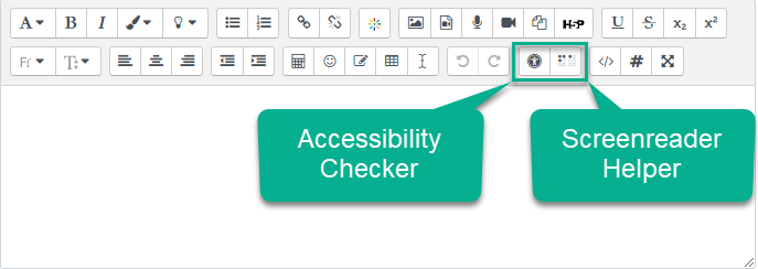
Accessibility Checker
Selecting the Accessibility Checker will provide a short report identifying the following possible accessibility issues:
- Images that are missing alt-text, unless they have been identified as decorative
- Insufficient colour contrast between foreground and background elements
- Long blocks of text that are not structured with headings
- Tables that are missing captions
- Tables that include merged cells
- Tables that are missing row or column headers
Screenreader Helper
Selecting the Screenreader Helper icon provides a brief report with information relevant to screen reader users, including styles used (e.g. bold text), a list of hyperlinks, and images that are included, displayed as alt-text.
References
Coolidge, A., Doner, S., Robertson, T., & Gray, J. (2018). Accessibility toolkit – 2nd edition. BCcampus. https://opentextbc.ca/accessibilitytoolkit/
Mayer, R. E. (2009). Multimedia learning (2nd ed.). New York, NY, US: Cambridge University Press.
Pilgrim, J. L., & Ward, A. K. (2017). Addressing diversity through the Universal Design for Learning lens. In Addressing Diversity in Literacy Instruction (pp. 229-249). Emerald Publishing Limited.